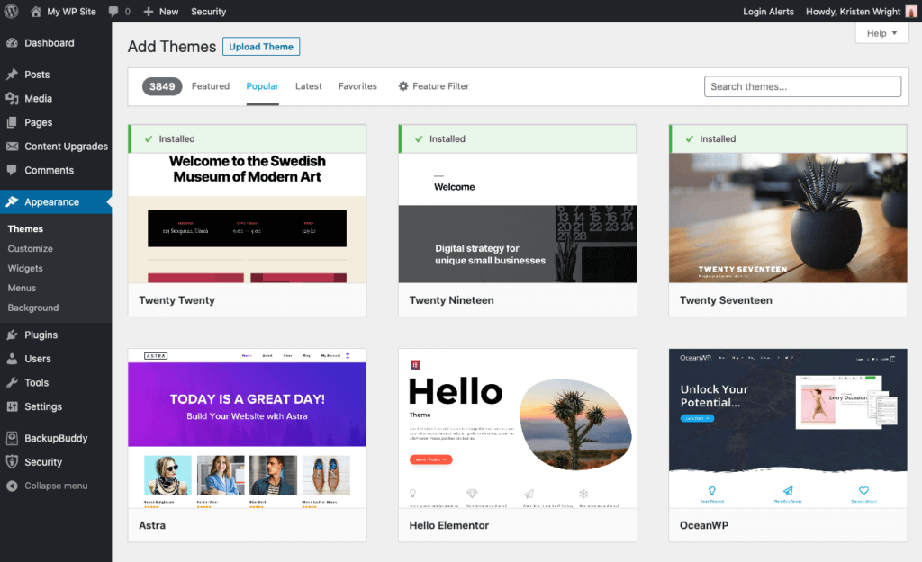
In the web development industry, quality web design is equal to credibility, and it has a direct impact on SEO. A well-designed website encourages the audience to return and get the latest news and information regularly. Despite an effective SEO campaign, a website may perform poorly if there’s not enough emphasis on design during the web development process.
Making your WordPress website stand out is easy, and here are some things you can do:
Use Attractive Colours- avoid using colours too creatively because you could end up having disastrous results. If you are not good with colour selection, it’s better to use two contrasting, neutral colours. In addition, it is a good idea to add one more vivid colour as an accent. Combined with small red elements, shades of black and white could make your WordPress website look more stylish.
Make A Memorable Logo- even if it is just a personal website, you should consider adding a memorable logo to your design. It is the face of your online brand, and many companies are willing to pay millions of dollars to hire professional logo designers. If you have the talent, you can make your own logo. For a personal logo, you may hire a freelancer to make one for $35 or more. A great logo for an online business may cost around $300 to make.
Choose Amazing Images- well-chosen images can make or break the visual appearance of your website. However, you must not cheap out when it comes to using images because bad ones will affect your online reputation. A quality image will cost you some money, but it will create lasting impressions on the audience. Free resources include Wikipedia Commons, Flickr Creative Commons and Unsplash. You may also buy quality images in Gettyimages, Veer, Shutterstock, and iStockphoto.
Use Good Fonts- fonts are important to ensure the legibility and professional appearance of your website. Make sure that the audience can read your content easily and if you are in doubt, consider using Georgia, Arial, or Helvetica. They have good legibility and have been used for decades for many different purposes.
Declutter- after you complete the design, find areas where you can simplify and declutter. For example, regularly check your website to remove annoying distractions, like pop-up forms, excessive advertising, auto-playing videos, unnecessary animation, and excessive social media buttons.
Contact AVHoster
To learn more, contact AVHoster today and speak with a web hosting expert who can answer any questions you might have.
If you enjoyed this article, please feel free to share it on your favourite social media sites.

