Designers need to have inspiration from time to time to help them develop something truly unique for their clients. This is true for website design. Seeing what is trending and getting a close look at the award-winning design may help you create a site that exceeds your client's expectations. Here are 14 fantastic website design pictures to get you started.
1. Goliath Entertainment
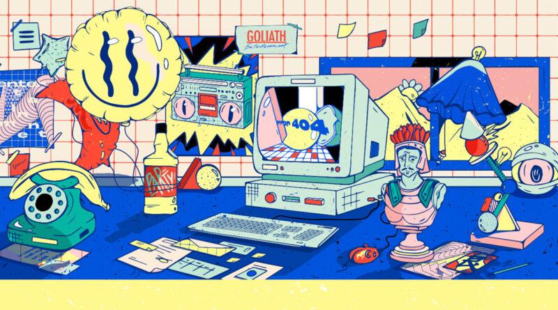
Goliath Entertainment's website won multiple awards, including being a CSS Winner and receiving award recognition in the STOD website awards. When visiting the site, the first thing which you will note is that it has a very Retro Design. Almost every item you see in the above picture has some interactivity with it. However, there are no lags in the web performance, which shows that you can have excellent web design without slowing downloading speeds.
Gothic Entertainment addresses two trends for 2021. First, the design has bold graphical fonts. Bold fonts are standard in videos as well as in illustration content. Simple fonts are used in text and headers. Second, the site uses navigational animation. Sites are encouraged to have user-activated animations within their sites. To minimize the size of your site, using CSS and other scripting languages for your design is recommended.
2. Block Rage
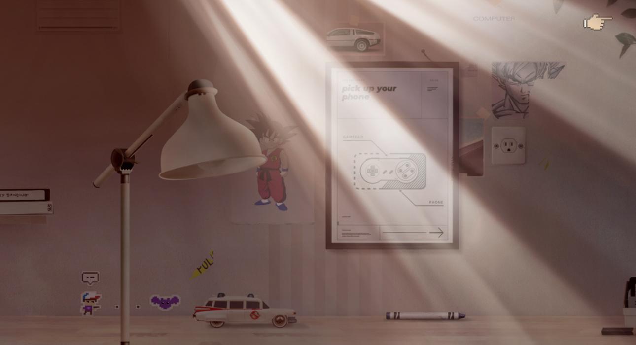
Block Rage's site shows that you can create a wonderfully aesthetic site with WordPress. The site is primarily a puzzle game. As the game has a great deal of interaction, script, and code, it gives the WordPress web hosting services used for this site a high level of creditability. Furthermore, it inspires designers to think outside of the templated WordPress box, pushing the boundaries of the platform's limitations.
Images that need to be layered, such as in this site, should save the components into different .jpg files instead of coding the various layers in one image. The reason for this is size and compression issues. While you may be able to attach coding within photo editing software and then save the image for the web, it is not the best practice as it increases the overall size and loading time of the page and it limits the designer's ability to quickly fix issues or change data that the client may have to the design.
3. Egg Shop
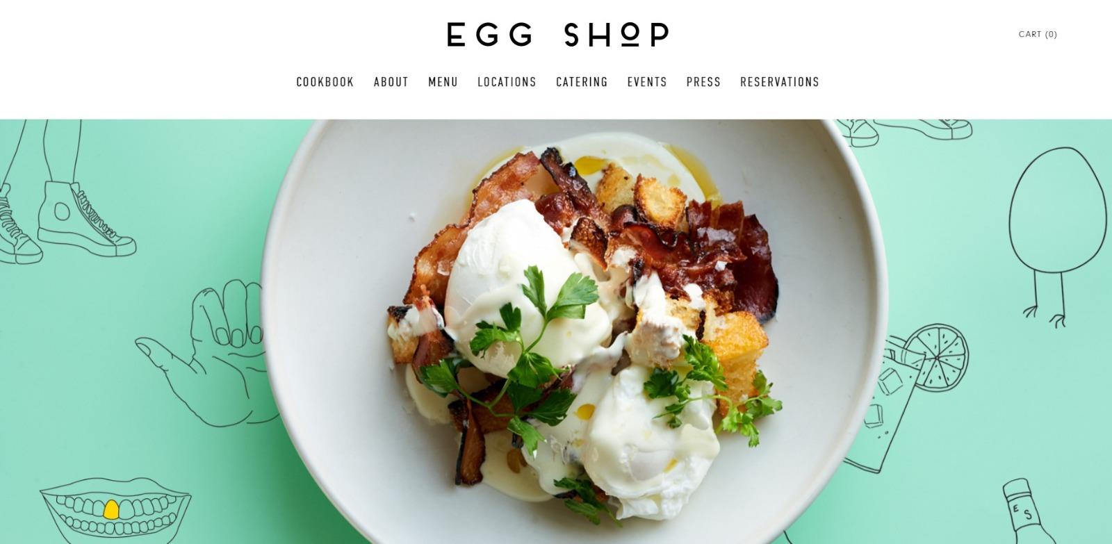
Simple but powerful, Egg Shop shows designers the impact and importance of having the right images and the proper image compression. Though the site houses many images, there is no reduction in the quality of the images offered to the viewer (no pixelization). Additionally, simplistic backgrounds with the images entice and invite the user to explore the site further.
4. Discover Avoriaz
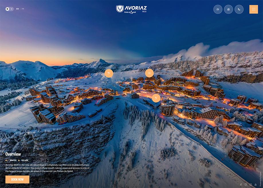
Discover Avoriaz first asks the visitor if they wish to visit in the summer or the winter. Once a decision has been made, and engaging panoramic is provided for the user. This, combined with the overlaying text, simple icon buttons, and stunning visuals, make this a site of inspiration.
5. Swissdent
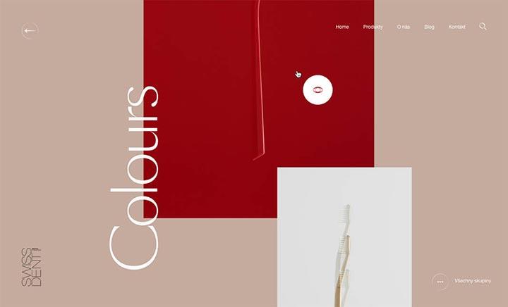
Swissdent is an E-commerce site built using WordPress. Because the site incorporates minimal design with a good CSS, HTML, and PHP coding level. Also, because the colour pallet's colour is not overly complicated, the user's eye is directed for the best possible results. Again, this statement about how good WordPress hosting CSS, JavaScrip, and other coding features are essential to website design.
6. Train Robber
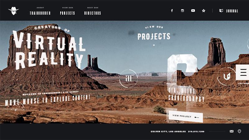
Overlayed text and dynamic animations, and dramatic imagery make Trainrobber.com well designed. Pay close attention to the font choices used on the site as they go to show that when choosing text, using a web-safe font that compliments your overall design can be just as effective as your images and animations.
Designers should also take note of how the text is skewed. Tilting and rotating the text within the web site's design can give it a more 3D appearance. Keep track of the CSS and Scripting applied to your fonts, texts, and buttons. You do not want to saturate your JavaScripting over, resulting in lags in website performance.
7. Pixar
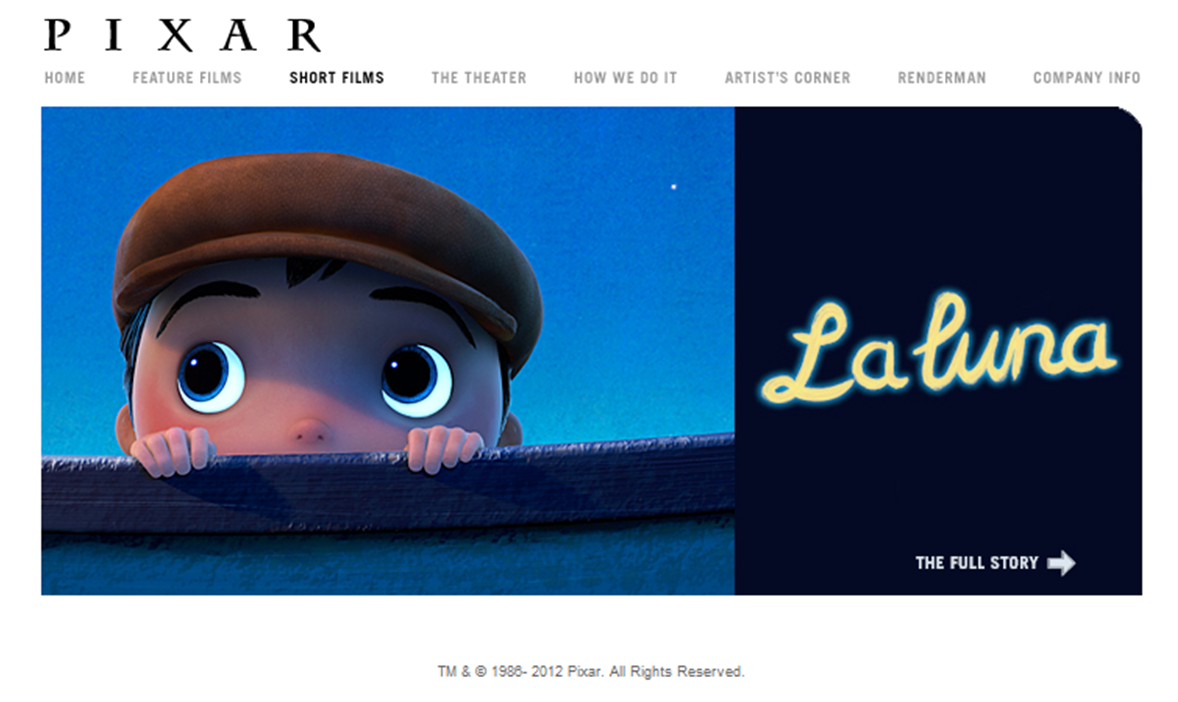
Looking at one of the top animation studios on the world's website can help a design see what visuals work. We find a simple scrolling website with overlaying font on the site. Navigation is kept highly simplistic. Those wishing to mimic the design could easily fit WordPress and use Wodpress hosting services to manage the site. While the navigational text is simple, the image text has been integrated into the image and helps the viewer focus on the content. If manipulating images for this effect, ensure that you compress your layers before uploading the site.
8. fifty coffees
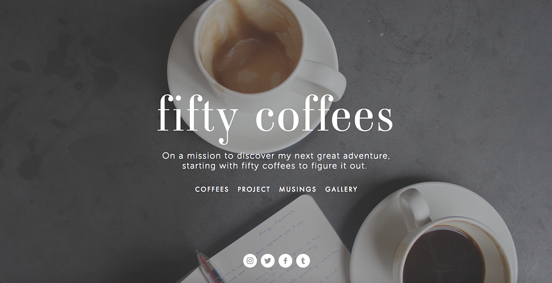
Clean design focuses on 2021, and fifty coffees show how well this concept works. Designers can see that the amount of material used in the design is not how well the design portrays the site's message. Fifty Coffees has almost a monochromatic appearance which goes with another trend of 2021, dark contrasts.
9. Collage
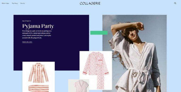
Collagerie's website keeps to a limited number of colours used within site. Additionally, as the site is e-commerce, branding photos are brought to the forefront of the design. Keeping a simple presentation and maintaining simple geometrics follow the design trends of 2021. This year, simple, clean designs are doing well.
10. Fixate
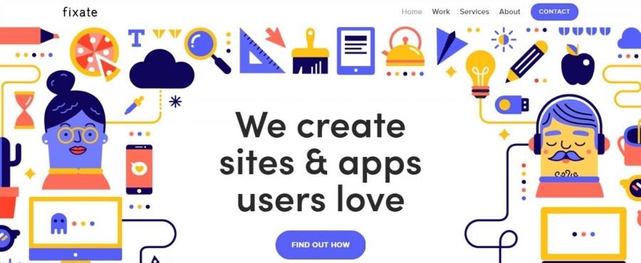
Fixate has won several awards over the years for its designs. Primarily, the company knows how to adapt their site to meet design demands. In the past, they have used line design and geometric shapes. As 2021 calls for more icon-based graphic design for sites, fixate has updated its site to mimic this style. Additionally, the site has focused on flatter tones giving it a more illustrative look (also a trend for 2021).
11. Wrist
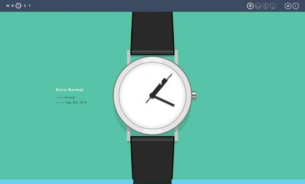
Wrist showcases a flat website design. When combined with the simple animation of the watch hands, the site is somewhat effective in focusing the viewer's attention on what matters. Note that the design does not call for an extravagant colour pallet. Things are kept simple and are toned down. Where there is a place for louder colours, e-commerce sites are not the place for such in 2021.
When using a WordPress template or including animations into an HTML page, be sure that you house your JavaScript and CSS in a dedicated folder on the domain and web hosting services management page. Most sites use dedicated servers for each of their clients. If your WordPress hosting service runs your page smoothly, do not haphazardly place your animation scripts. Although the web performance may be excellent for your computer, other platforms may find loads to take longer if not prioritized and maintained in an orderly method.
12. Creative Cruise
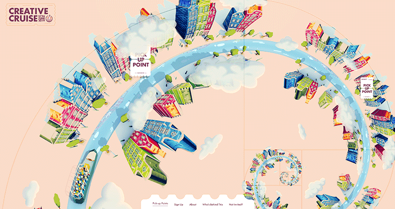
When the site's content conveys fun and Entertainment, bold colours are appropriate. However, the colours should be matched with trends in design, as can be seen in creative cruises. While you have the bold reds, greens, and blues within the site, you also have the softer pallet, which is trending. Additionally, the illustration with the Fibonacci design focuses on an eye-popping white navigational bar.
Designers should look for ways to incorporate well-known geometric shapes and well-known symbols into their designs. In Creative Cruise, not only is the symbol the focal point, but the design creates a visual looping, making it more engaging. Designers should avoid using shapes that limit the viewer's eye to one side of the page but opt for F shape or O shaped design formats.
13. Extreme Tree Fellers
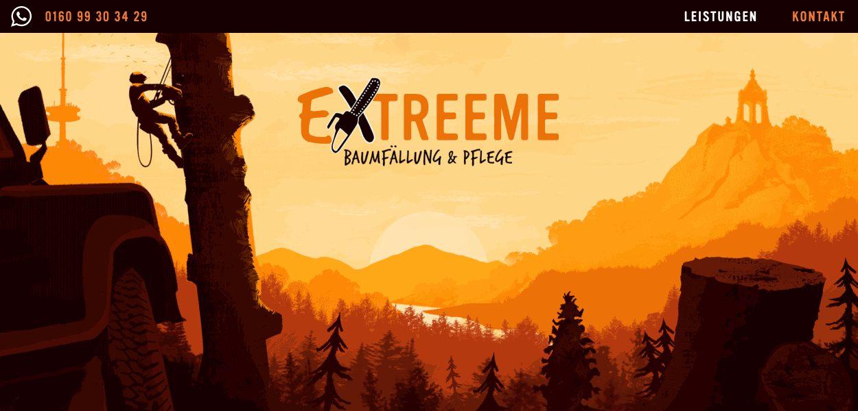
Illustration has seen a tremendous spike in website designs in 2021. Extreme Tree Fellers is an example of how illustrations can add visual depth to your website. Primarily, the design of this site gives a foreground, mid, and background to the landing page. The placement of the tree on the left is not haphazard but draws the eye to the contact number. Using a dark contrast for the navigation bar makes it easy to see the navigation headers and adds the necessary break between the illustration.
Web Designs using illustrations must compress their images for optimal loading. When using fonts, overlay the fonts. This adds to the overall user experience.
14. Sometimes Always
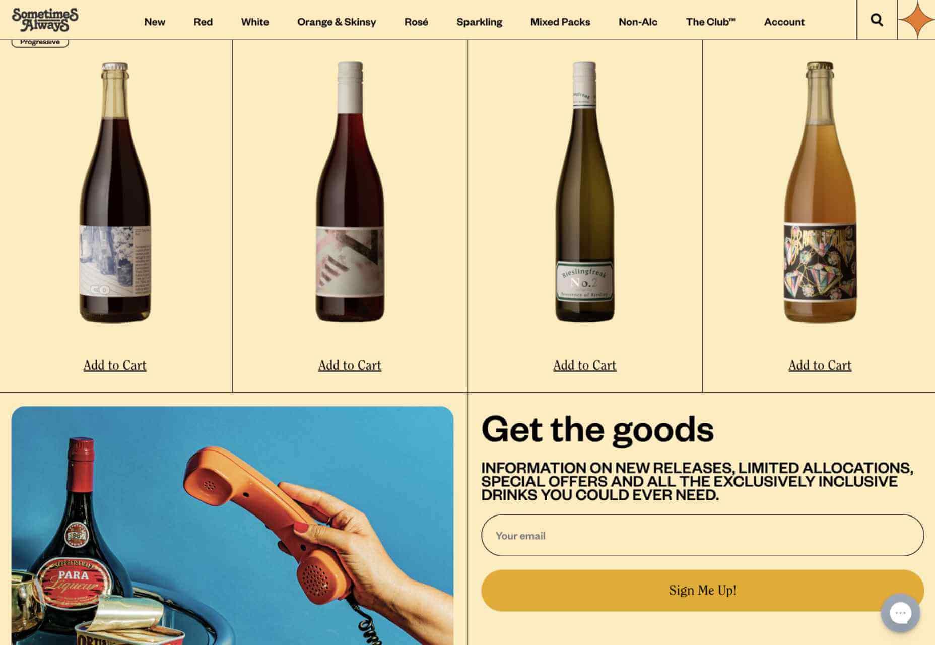
Combining all of the trends for 2021, Sometimes Always is an excellent example of what can be done when design and functionality are at the forefront of the website. Firstly, the design has simple fonts. Yes, you have the logo with a creative font, but even that font has been designed to have a retro feeling. Secondly, the branding imagery is explicit. Again, the site uses images that give the site a vintage and test of time look. Thirdly, lines and the classic table design from the 90s have been used to tone down the visuals while at the same time bringing the products for sale to the front. Finally, the site has a quick and efficient call-to-action button.
When designing a website for 2021, careful consideration needs to be given to the overall content. As trends for design in 2021 dictate a more minimalistic and geometric visual to the overall design, too much clutter on the page could minimize your visitors. In direct correlation to the site's design is how effective the domain name is. There are many affordable WordPress domains and hosting services available. Most of these are within the top-rated web hosting sites.
